Continuing from the Part-1 of this posts series which can be read here The Secret To Building An Ecommerce Website That Thrives On Search – Part 1
Anatomy Of A Skyscraper Content For E-commerce
What exactly does a skyscraper look like for e-commerce?
The style of a skyscraper doesn't really vary too much from affiliate marketing.
It's just very intentional about getting people to a product page but we also want them to be learning and getting educated on what the best buying decision for them is along the way.
In the beginning skyscraper piece of content used to be in for e-commerce at least up until about maybe two years ago, for example top treadmills for home gym.
And then there were just seven or eight like very brief summaries with a link to a product and there was no content.
Then people started adding a little bit of more in-depth content.
What's working now and what should continue to work for the silver future is what I detailed here in the image below.
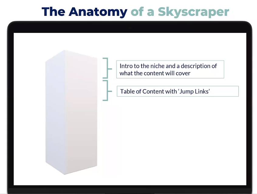
At the beginning obviously something very simple, some of this will seem very obvious but it does work in this order.
A brief introduction to the niche and a description of what the content will cover.
You want to give people the idea, the understanding of what they're going to find if they continue reading.
Because we don't want to lose them straight away because we didn't link immediately to a product page.
Right after the brief intro, we will give them and then a table of content with jump links.
If they don't want to read the whole thing or this is not the first time that they've been on this page they can go straight to the section of the post that interests them most.
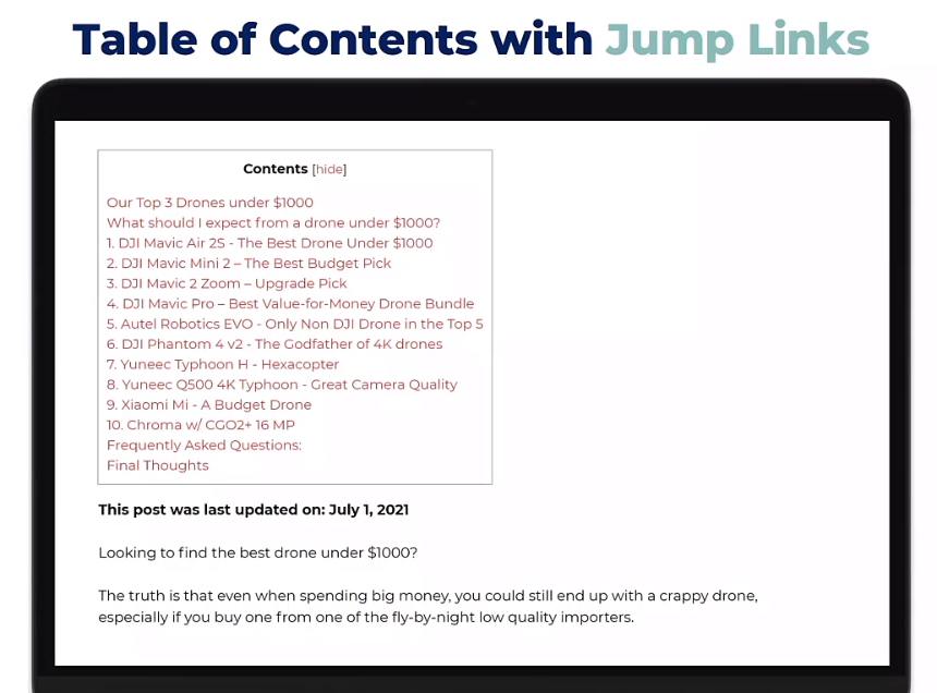
Here's just an example of what a table of content could look like with the jump links.
By clicking on any of these products you would just then scroll down automatically to that section on the blog post.
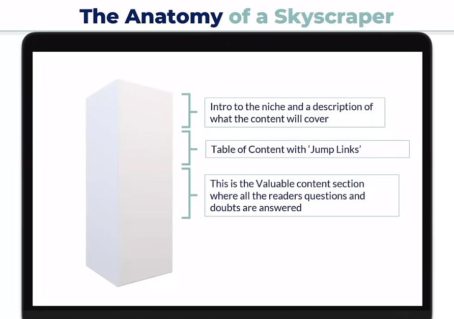
After the table of content here's where we put in the most valuable content in the blog apart from the actual products themselves.
Because here is where we're going to answer all of the doubts that are in their head, maybe dispel some of the misconceptions about the niche or about a specific product, etc.
So they're coming to the conclusion that, okay, I'm learning all the information I need, I didn't understand that this product is great for me or this product is not great for me and so on.
And this is the part where they get so much information that they don't feel like they need to go and click on another search result to get more information.
So this is the part where we can use for example what i like to do is i like to use a resource called answerthepublic.com which is a free website.
You can just go to enter your keyword and it will give a sort of a mind map visual and a nice list of all of the questions that are asked on search engines about a specific keyword.
We have written more about this tool and similar other tools in another posts series Million Dollar Content Road Map: The Definitive Guide – Part 1
In there, you can get lots of comparison type questions or just a bunch of what is the best x for y etc. And you have like a year's worth of content ideas in there.
What you can do is you can pick some of the best questions and add them there. You could be using some technical SEO like h2 or h3 tags in the question and in the answer.
When you're adding that piece of content to this section of the blog and in the past, you have been asked a bunch of questions in the past and many of those repeat questions that customers always ask this is a great place to include them.
You're being asked these questions or your customer service team is being asked these questions repeatedly not only should they belong on your faq page but also on the product page you can add them here.
Because if people are asking you they're probably typing them into the search engines as well and you can start ranking for those questions.
After this valuable section which will take up most of the words on the blog what we do then is that we then we introduce the products that we want to drive traffic to.
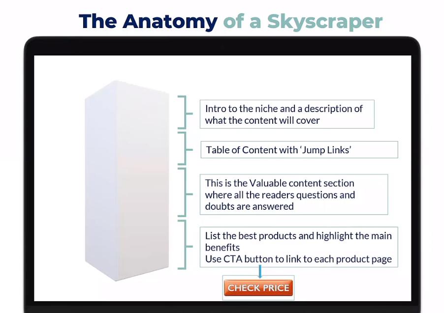
This is the part where we show “best rowing machines for your home” or “for a commercial gym” or whatever.
Then you will go into your will be listing the products and highlighting the main benefits.
This isn't the place where we're going to go in and break out the details of all of the list of specs, the measurements, the speed and other technical details.
Because what we'll do then is after we've given a brief overview of why we think this is great and why we think you know it made the list.
We then will invite people by using a call to action button to link to the product page and we'll send them over there.
In the beginning, I wasn't aware of the importance of an actual button with something like check price or see details here or click for further information which then leads them to the product page.
Because my skyscraper method has basically evolved over time.
In the beginning, I was using the hyperlink that was linking to the product page in my store as either the product title or the image.
Over time I noticed that affiliate marketers were always using these calls to action that were very visible and when I started asking people about this.
They said, very simple, make it stupid simple for people to understand what they need to do because if they don't know that the blue text on your black text paragraph is a link they may not click it.
Most people now are reading or visiting e-commerce stores from smartphones.
They don't have a mouse so it's even less obvious when something is a link because you don't hover your mouse over the text to see if it's a link.
You could just be completely missing out on a bunch of people that do want more information but they just didn't realize that you were linking to it.
A clear button with a clear call to action like checking price or seeing full details here will increase your click-through rate and get people onto the product page.
An Example Of Product Listing Page
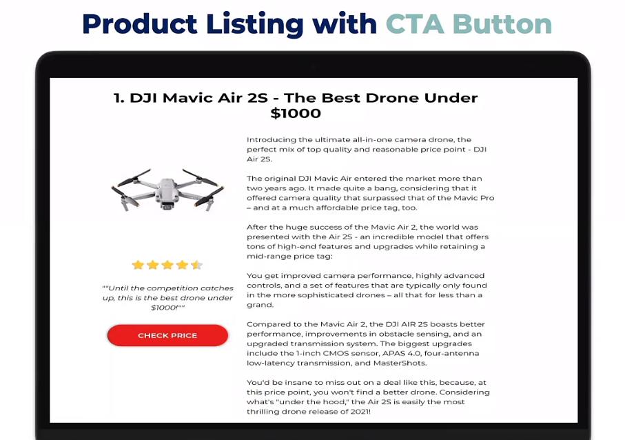
Here's just a really good example I just found from an affiliate website where there's like some brief information about why it's great, etc.
There's the check price button that will then lead to an amazon store because this is an affiliate website that I just chose randomly.
They link to amazon and they even include the four and a half star review which is just an image.
That's just part of the image with the product which is also a very good idea because it sort of reassures people that other people are buying this and other people are liking it so they may even click through more likely.
That's basically what the actual anatomy of the skyscraper for e-commerce should look like and that will almost always likely get you on to page one just by having the biggest and baddest, absolutely jam-packed kitchen sink value information all in one place.
But because we're in e-commerce there is one big question that I get all the time “where do we put this skyscraper piece of content?”.
For example, Shopify and woocommerce, there is a blog section.
The first thing you do is you just want to fill it with two or three pieces of blogs so it doesn't look empty, so people don't get a weird vibe off your empty store like an empty page or no blog section.
If we were to think about it logically the best place to put a piece of skyscraper content is often the collection page or the category page.
For example, if you're in the home gym space and you've got “treadmills”, “running machines” “stair climbers” etc.
You could have separate pieces of content. You will have a skyscraper for each niche or each category and they could be on your blog section.
But what happens is that if we put them on the blog section we're then going to be linking either to the collection page at a product page.
The collection pages are naturally already linking to the product pages and it's a really good place to house this piece of content because then we're having people already land on the collection page and at the bottom of the collection, page is the list of all of the products as well so it just makes sense.
Collection pages or category pages are a great place to have skyscraper content because it's just a natural fit for linking to products.
And even if they don't click through, they're already on the collection page which is closer to the add to cart button than let's say a blog post.
Collection pages are naturally one click from the home page so click depth is great for these pages.
The least amount of clicks from the home page to that page tells the search engines of the relevancy of that page.
If it takes four clicks to get to it, it's not very relevant. If it takes one click it's likely very relevant.
It's a fine line where you need that one clicked depth but you don't want to send people that have already found your store.
You don't want to send them to a blog post because if they made it to your store they're likely going to look for a collection or product page, we don't want to direct them away from getting closer to the id card
Collection pages are naturally a very good home for the skyscraper content because of also that one click depth away from the home page without having to then try to disguise other links in the home page.
Blog posts hosted in the blog section need to be linkable to the home page in order to achieve one-click depth.
Backlinks are easier to get for blog posts rather than collection/product pages.
Later as you start trying to get backlinks to these if it's a collection page some blogs or websites is a little bit more reluctant to link to a collection page.
Because it's a little bit more salesy, it's clear that the link is driving to products
You're more likely to get backlinks to a blog post than a products collection page.
E-commerce Product Page Tips
Here I just put a very short quote because it sort of describes this page very well.
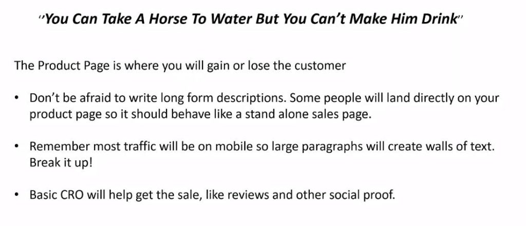
“You can take a horse to water but you can't make it drink.”
What does that mean? It means that you can write the best piece of content on the planet and you can get people to click through to your product page because you've got a very clear call to action in the product listing on your skyscraper.
But if your product page absolutely sucks then you're probably not going to get people to buy from you.
A very common misconception about product pages for e-commerce store owners is they're afraid to put too much content on the product page because that could just distract people from the add to cart button.
But if it's a completely bare-bones page with just one line of text, there's not going to be a lot of information to help people make that final decision.
Don't be afraid to write long form descriptions. Some people will land also directly on your product page so it should behave like a standalone sales page.
Because if you just put one line of text on your product page it will never rank on its own organically.
So you're not going to run the risk of getting free traffic to your product page because it sucks.
If you do have a lot of content on the product page well, guess what, the product page is going to start ranking organically too.
That's just extra traffic.
So don't be afraid to write long form product descriptions.
One pushback I get from people when I recommend that the collection page and product page should have a lot of content is that if you put a lot of content on a collection page, for example, it's going to push the grid of products down to the very bottom and people will never find it.
But there's no harm in putting in a read more clickable option after the first or second paragraph.
This doesn't have any impact on SEO because the Google spiders are still able to crawl the website and page and understand what the content is.
And if the person wants to continue reading they can just click the read more or continue reading button and then the rest of the content will open up.
You can do the same on a product page if you're completely afraid of something like that happening.
Remember most traffic will be on mobile. So large paragraphs will create a wall of text.
If you do take my advice and write long-form descriptions just remember to break it up and check on your own mobile phone what it looks like on mobile.
Because if you just have a big wall of text then that will actually create anxiety in people and people will just click away because they're on the phone.
What I like to do is I like to break it up into very small paragraphs and then an image and then a very small paragraph and an image and if the image can be relatable to the very small paragraph that is even better.
Otherwise, just chop it up with some lifestyle images or close-up images of the components and stuff of the product and that will make it visually for people to scroll through on their mobile and it also looks good on a desktop.
Since this is a product page basic conversion rate optimization will help get the sale like reviews and other social proof.
We can have a whole other post of just about what goes on to the perfect product page. That's a whole different conversation about conversion rate optimization.
Let us know in the comments below if you will be interested in another post on product page optimization for E-commerce and I will make time for it to write it.
If you invest all your time on content marketing dedicate some of that time to the product page as well because that's where you're trying to direct people to and you obviously want them to then follow through and pull this trigger.
We will be writing more interesting topics on this subject in the next part of this posts series. Keep an eye on it by subscribing to our newsletter.